Bluestone Redesign
This project focuses on redesigning the search and discovery experience for the Bluestone e-commerce website. The goal is to create a more intuitive, efficient, and modern interface that enhances product exploration and user satisfaction. The redesign is proposed specifically for web platforms, improving key areas, improving key areas such as:
-Landing page
-Mega menu structure and categorization
-Search bar clarity and placement
-Product listing layout (PLP)
-Filter usability and visual hierarchy
-Profile access and account-related navigation
The proposed design emphasizes clarity, responsiveness, and user-centric navigation, aligning with modern e-commerce UX standards.
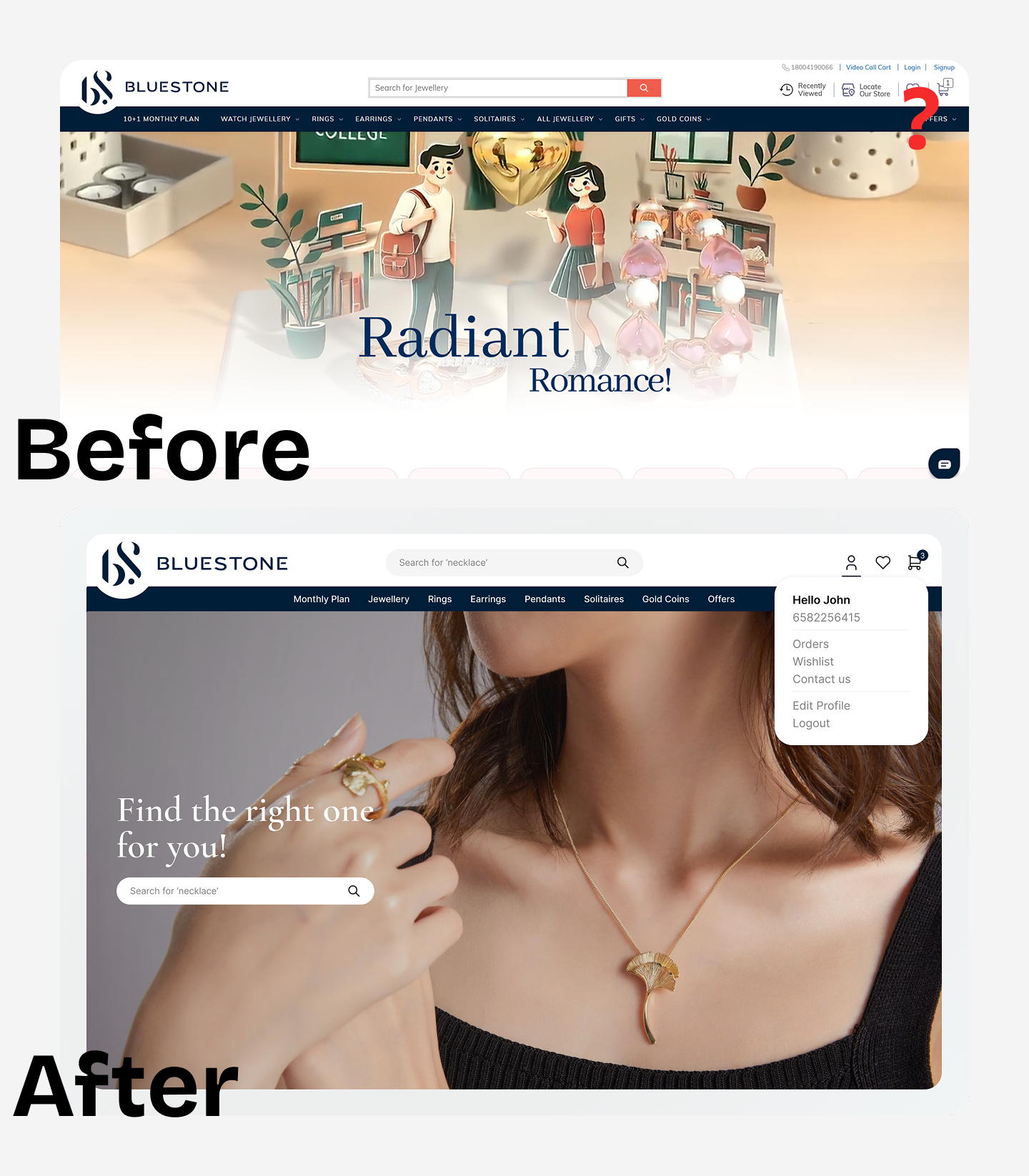
Issues with the home screen
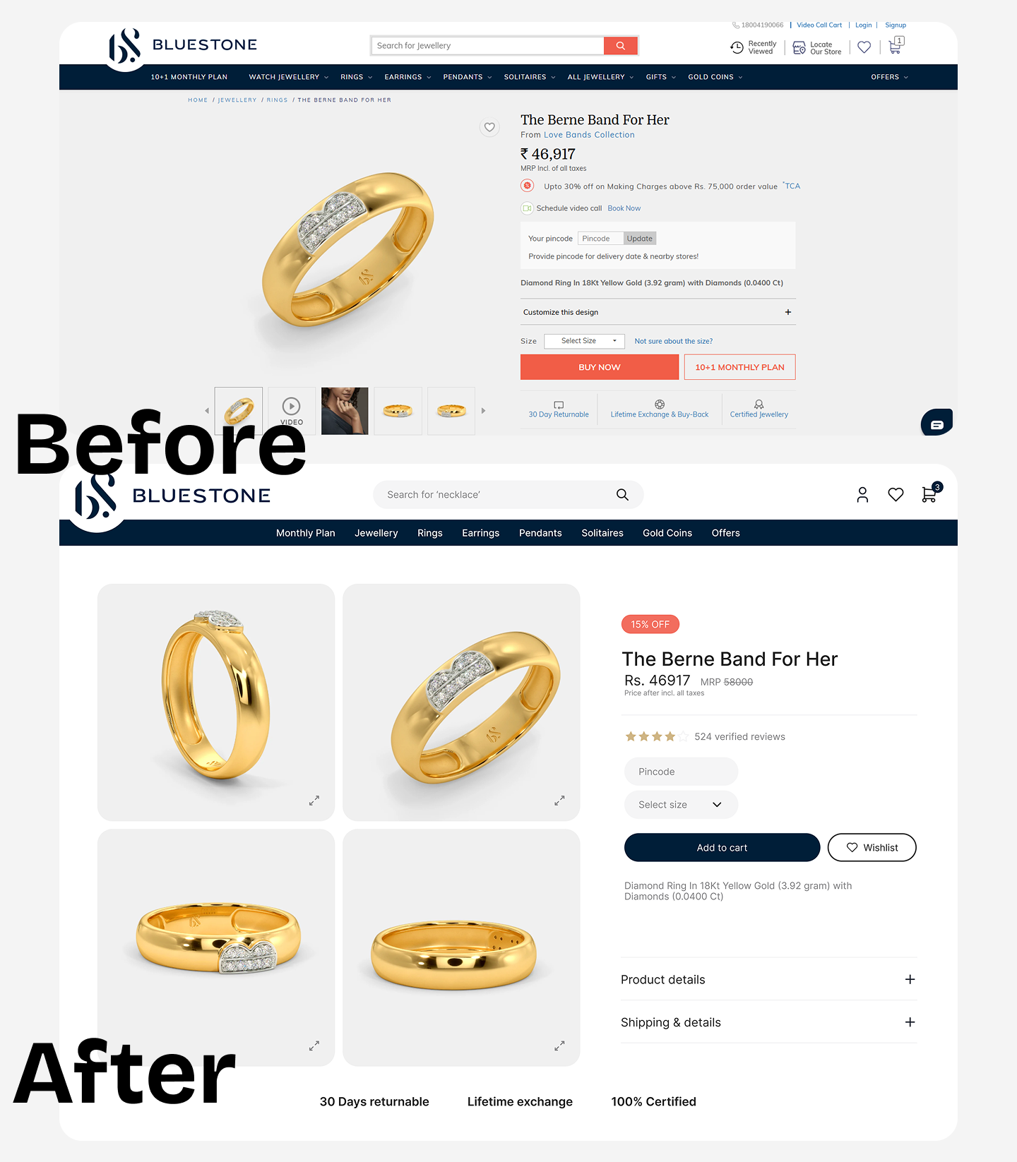
1. Inconsistent Product Page Design
Issue: Product pages have a cluttered and inconsistent design.
Impact: Inconsistencies can confuse users and erode brand credibility.
Supporting Data: Consistent design elements across pages enhance user trust and can lead to higher conversion rates.
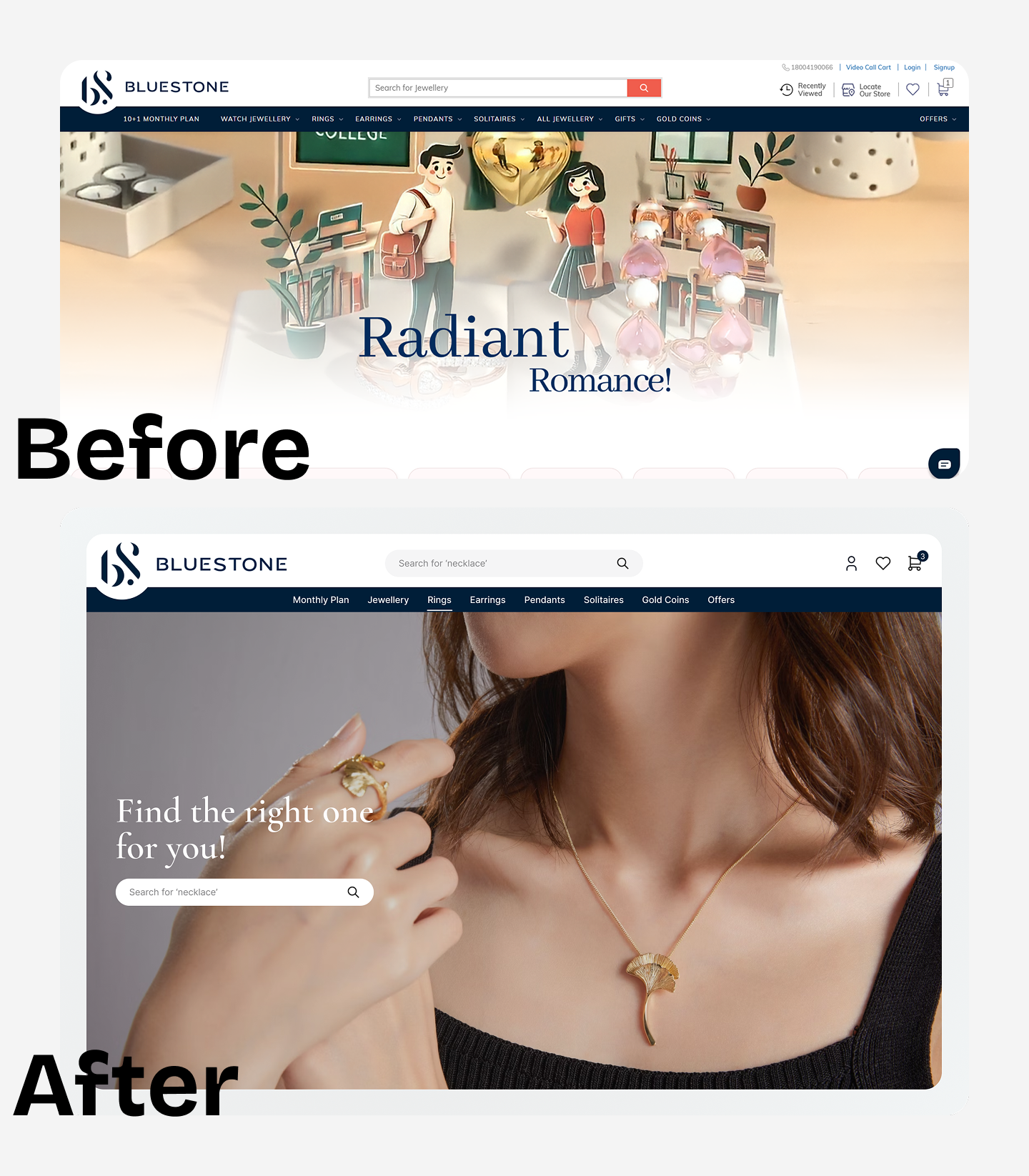
2. Lack of Human Connection in Imagery
Issue: The homepage uses illustrations instead of real-life images.
Impact: Users may find it hard to visualize products, affecting purchase decisions.
Supporting Data: High-quality product photos, especially those featuring real people, can significantly increase conversion rates.
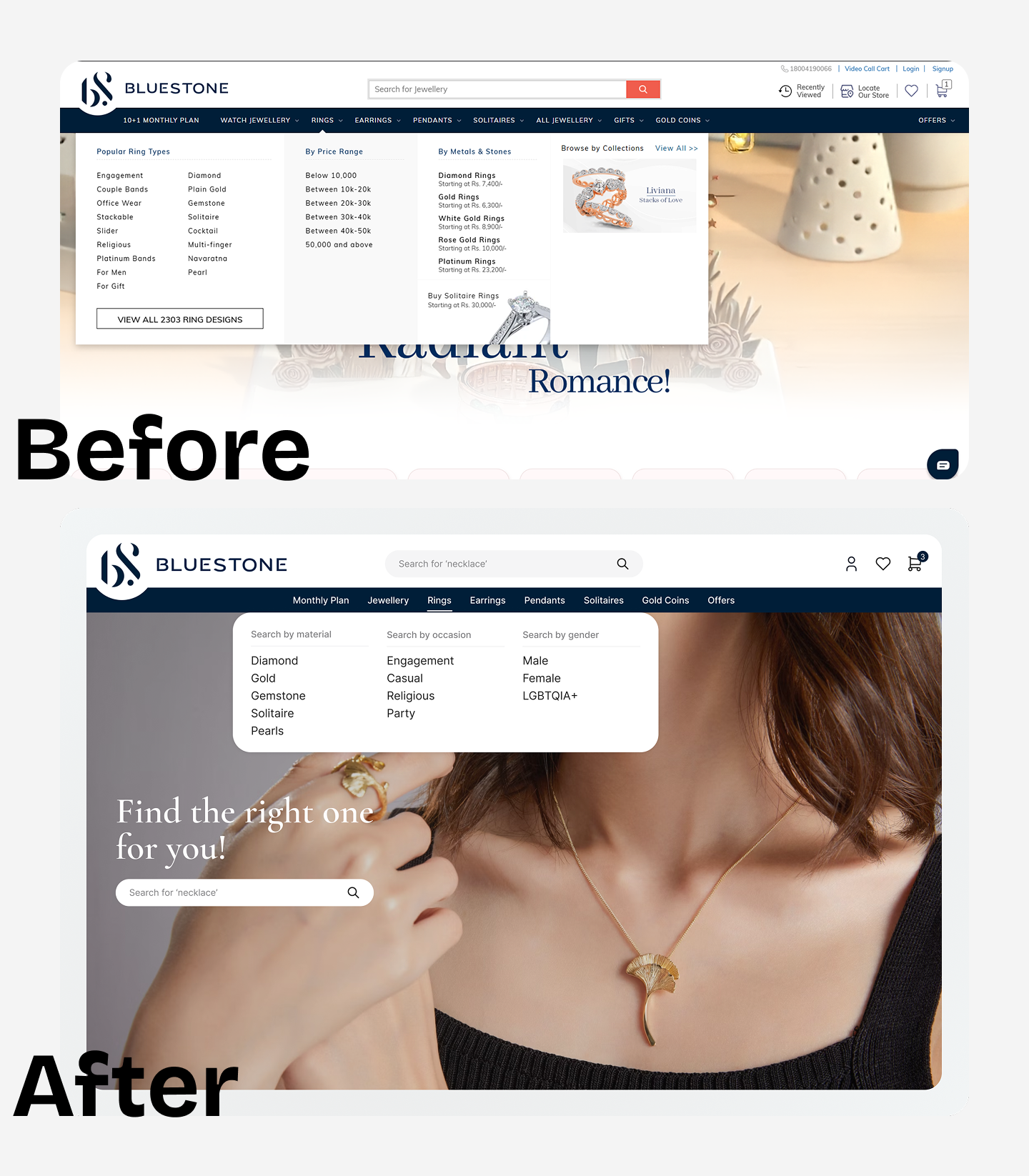
Issues with the mega menu
1. Overwhelming Layout: Too many categories and links shown at once.
2. Poor Visual Hierarchy: Lacked clear separation between groups.
3. Cluttered Design: Limited spacing made it hard to scan.
4. Distracting Elements: Images and text competed for attention.
5. Hard to Navigate: Users had to visually work harder to find what they needed.
Absence of profile icon
1. No Clear Entry Point: Without a profile icon, users may struggle to find where to manage their account.
2. Hidden Functionality: Important features like order history or logout were not easily discoverable.
3. Breaks Convention: Deviating from standard patterns increases cognitive load and friction.
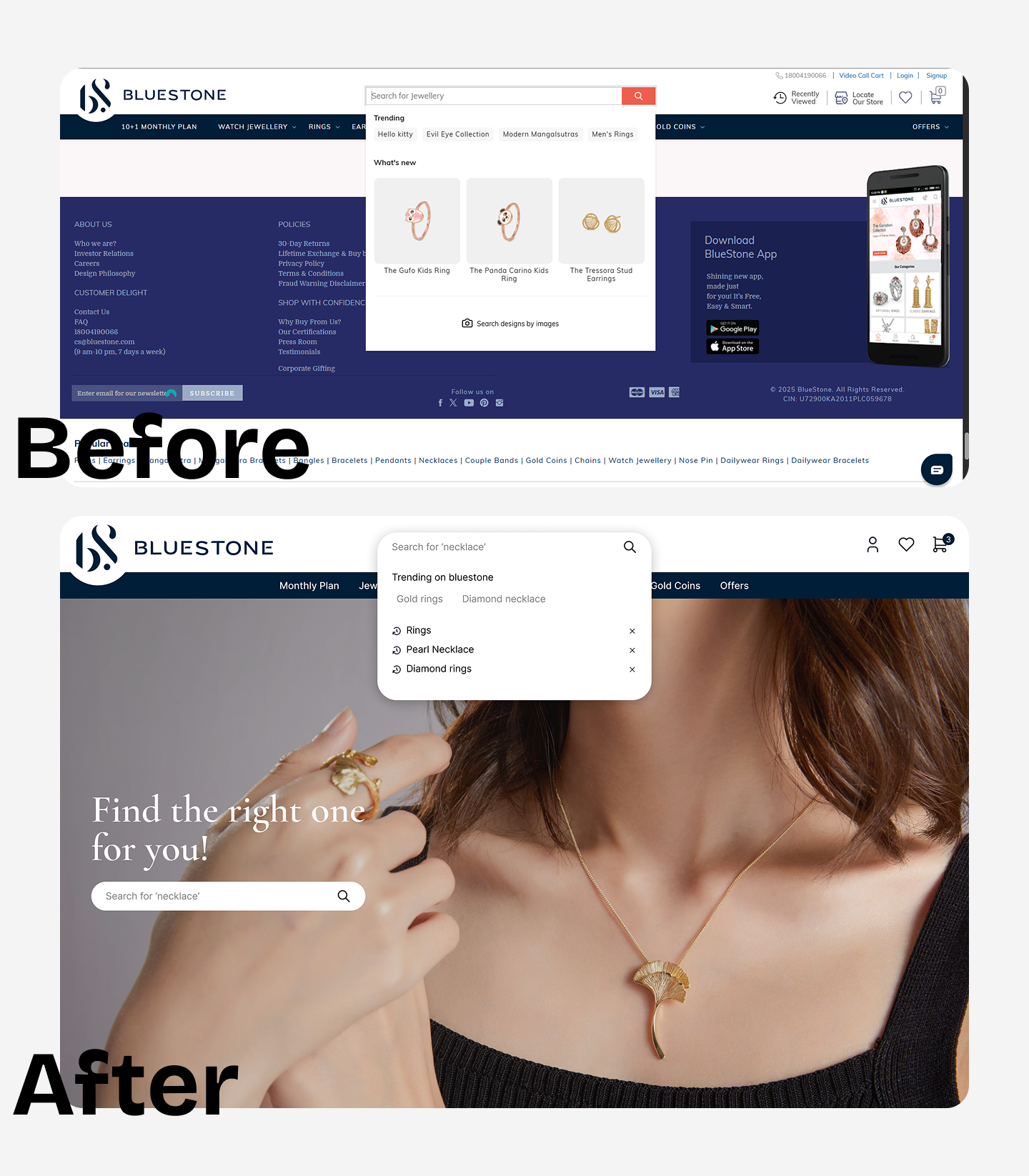
Issues with search bar
1. Issue: Suggestions like "Hello Kitty rings" don't align with user intent.
2. Impact: Irrelevant suggestions can lead to user frustration and increased bounce rates.
3. Supporting Data: Personalized product recommendations can increase conversion rates by up to 320%.
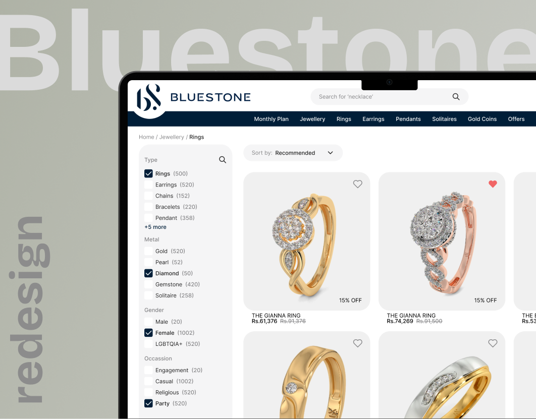
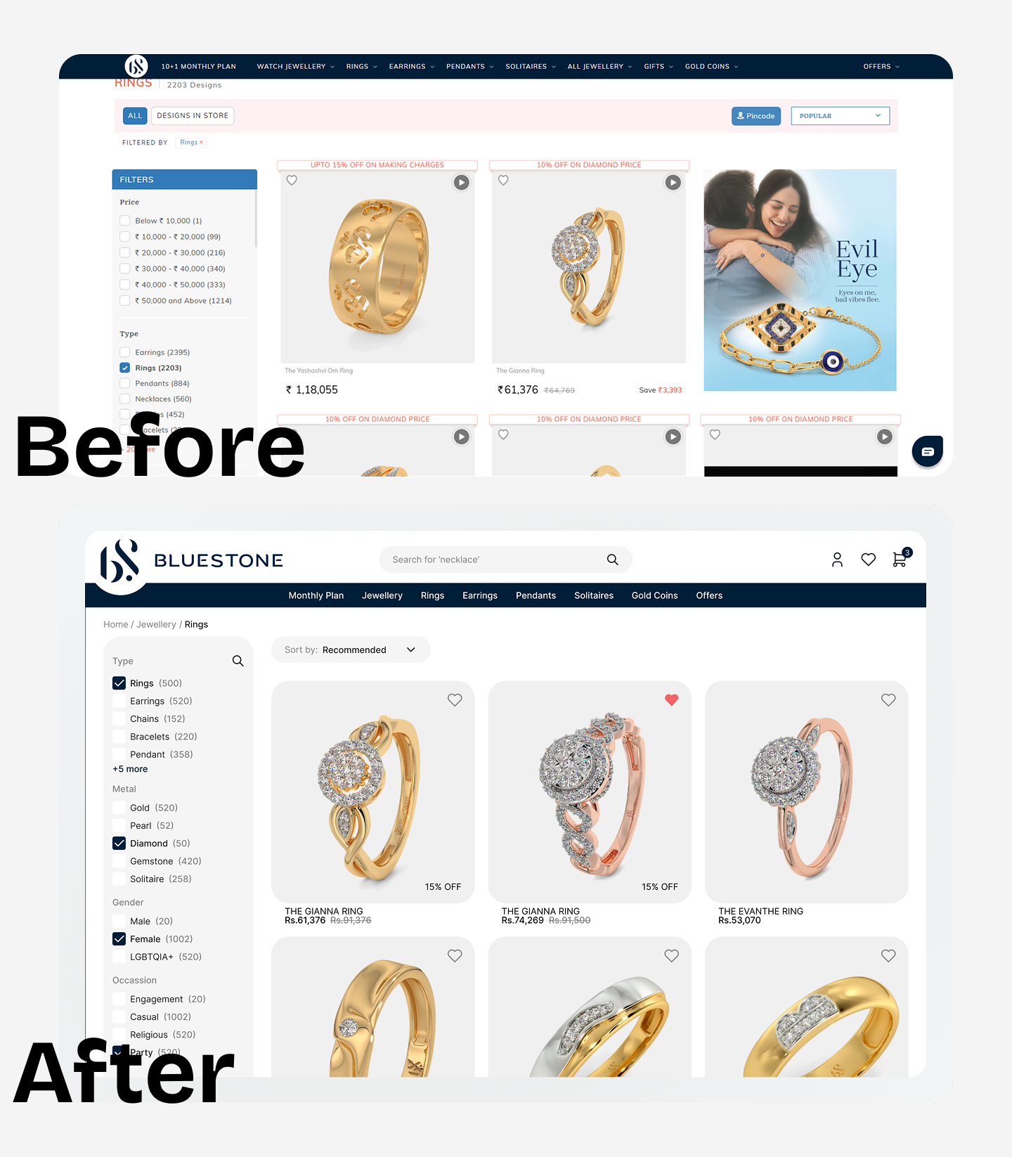
Issues with product listing page
1. Outdated Visual Style:
Old-fashioned layout and typography make the site feel less premium.
No modern visual hierarchy
2. Cluttered Layout:
Too many elements competing for attention — price tags, discounts, badges, filters, and ads all crammed together.
Dense filter panel with little spacing makes it harder to scan.
3. Low Focus on Product Visuals:
Product images are small and don’t stand out.
Promotional banners are taking equal (or more) attention than actual products.
4. Poor Use of Space:
Left sidebar is heavy, while right side has an ad that distracts from shopping.
No grid refinement or balance in alignment.
5. Unintuitive Interactions:
Icons like wishlist and video previews are not clearly explained or visually appealing.
Sorting and pincode elements feel misplaced and underdesigned.
6. Misaligned Advertisements:
Issue: Advertisements are not properly aligned, creating a cluttered interface.
Impact: A disorganized layout can distract users and diminish trust in the brand.
Supporting Data: A clean, uncluttered layout focusing on vital information improves user engagement.
Issues with product page
1. Missing 'Add to Cart' Button on Product Pages
Issue: Users must navigate to individual product pages to add items to the cart.
Impact: Additional steps can hinder the purchasing process and increase cart abandonment.
Supporting Data: Streamlining the add-to-cart process can significantly boost conversion rates.
2. Absence of Product Reviews
Issue: Product pages lack customer reviews.
Impact: Without social proof, users may hesitate to make purchases.
Supporting Data: Displaying customer reviews can lead to an 18% uplift in sales.
3. Misleading 'Buy Now' Button Functionality
Issue: The 'Buy Now' button adds items to the cart instead of initiating the checkout process.
Impact: This unexpected behavior can confuse users and disrupt the purchasing flow.
Supporting Data: Optimizing the checkout process can result in a 35% increase in conversion rates