Commate
Commate is an all-in-one app designed to bridge the communication gap between residents and service providers within a housing society. It empowers residents by offering a streamlined platform to report and resolve issues like maintenance, noise complaints, and security concerns with ease.
KeyHighlights of this project:
Survey Analysis: A deep dive into user needs and pain points through colorful, data-driven feedback boards, helping identify and prioritize areas for improvement.
JTBDs & HMWs: Clear identification of Jobs To Be Done (JTBDs) and How Might We (HMW) statements to address residents' challenges effectively.
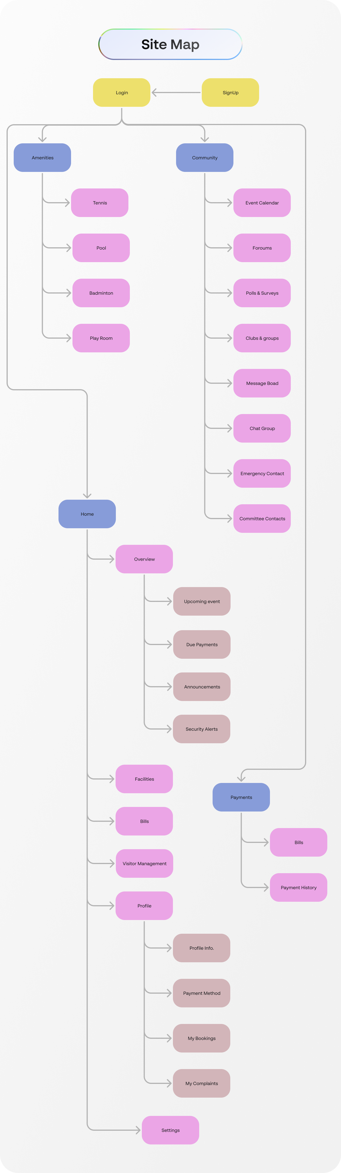
Site Map: A thoughtfully structured app framework to enable intuitive navigation between features like Amenities, Community, and Services.
User Flows: Visualized processes for seamless interactions, from booking amenities to reporting maintenance issues, ensuring a smooth user journey.
Style Guide: A sleek, modern aesthetic defined by BR Sonoma typography and a vibrant yet professional color palette, maintaining consistency and usability across the app.
Survey Analysis
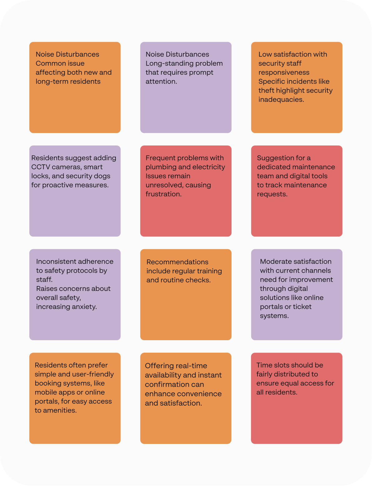
The survey conducted aimed to gather actionable insights to refine user experiences and align with user expectations. Key highlights from the analysis include Participant Demographics, ensuring a comprehensive understanding of varied user perspectives.
Pain Points Identified, users reported challenges, highlighting areas for improvement.
JTBDs
1. When I am trying to work or relax at home, but noise disturbances from neighboring apartments or common areas disrupt my peace and concentration.
2. When I discover a leaky faucet, faulty electrical wiring, or other maintenance issues in my apartment that require immediate attention to prevent further inconvenience or damage.
3. When I return home late at night or notice suspicious activity in the housing society premises, prompting concerns about my safety and the effectiveness of security measures.
4. When I have complaints, suggestions, or queries regarding maintenance, security, or other aspects of living in the housing society and need to communicate with management for resolution.
5. When I seek opportunities to participate in community events, voice my opinions on housing society matters, or contribute to decision-making processes that impact residents' lives.
HMWs
Problem: Residents face recurring issues related to maintenance and security, which are not addressed efficiently due to a lack of systematic problem reporting and prioritization by the management.
HMW Statement: How might we develop a more effective system for residents to report and track maintenance and security issues to ensure they are addressed promptly and satisfactorily?
Problem: Residents often feel dissatisfied due to inadequate communication channels with housing society management, which affects their ability to report issues promptly and receive timely updates.
HMW Statement: How might we improve the communication channels between residents and housing society management to ensure timely reporting and updates on issues?
Problem: Housing society managers struggle with not knowing resident issues beforehand, leading to inefficiencies in time management, prioritization of tasks, and assignment of the right skilled workers to resolve these issues.
HMW Statement: How might we implement a predictive management tool that allows housing society managers to know about potential issues in advance, thereby improving the prioritization and assignment of tasks to skilled workers?
Site map
The site map outlines a clear and intuitive structure, designed to enhance navigation and streamline the user journey.
This organized structure ensures seamless navigation, prioritizing accessibility and user engagement at every step
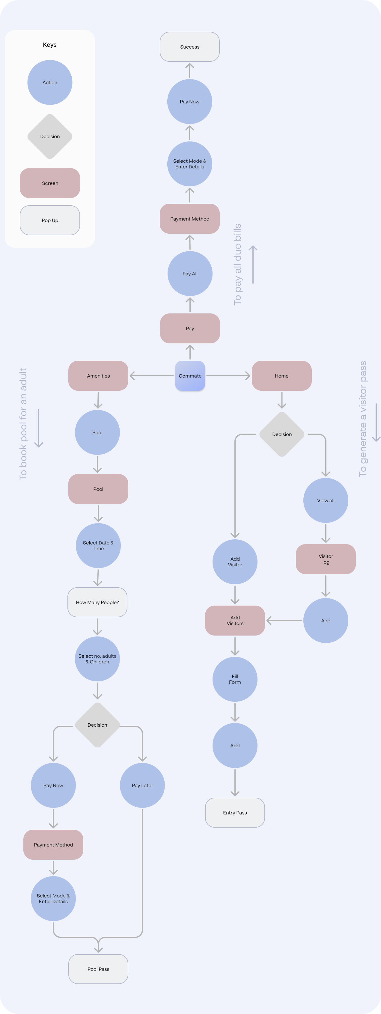
User flows
This section highlights intuitive user journeys designed to simplify common tasks:
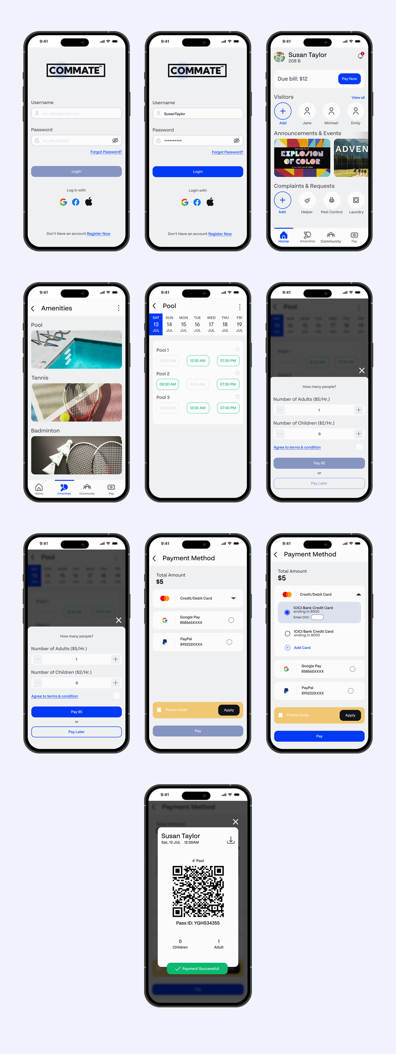
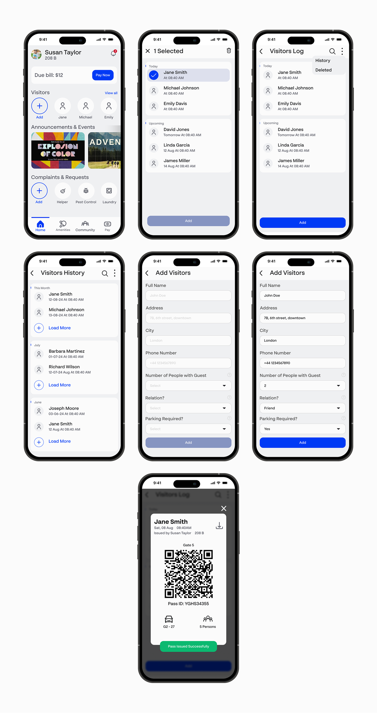
Visitor Pass Generation – A seamless flow for creating and managing visitor passes.
Pool Booking – Effortlessly book a pool session tailored for adults.
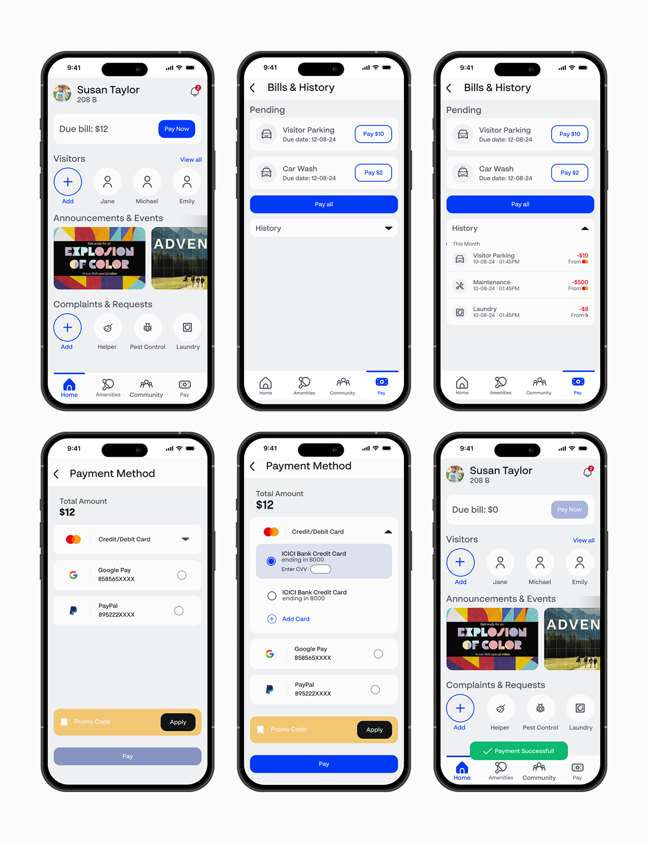
Bill Payments – A streamlined process to pay and clear all due bills.
Each flow emphasizes clarity, efficiency, and user convenience, ensuring a delightful experience.
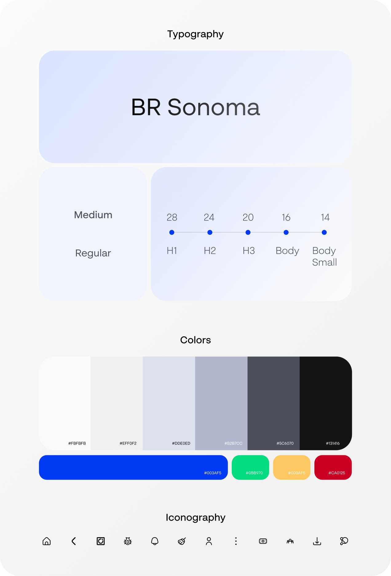
Style Guide
This style guide defines a cohesive and modern design system that prioritizes clarity and user engagement.
Typography: The primary typeface, BR Sonoma, sourced from Brick Foundry, combines contemporary aesthetics with exceptional readability. Medium and regular weights are employed, creating a distinct hierarchy with font sizes ranging from 28px for headings (H1) to 14px for small body text.
Colors: A harmonious palette features neutral tones complemented by vibrant accents. The primary blue (#003AFF) conveys energy and trust, while the supporting hues ensure versatility and visual balance.
Iconography: A clean and consistent icon style enhances usability and supports an intuitive user interface.
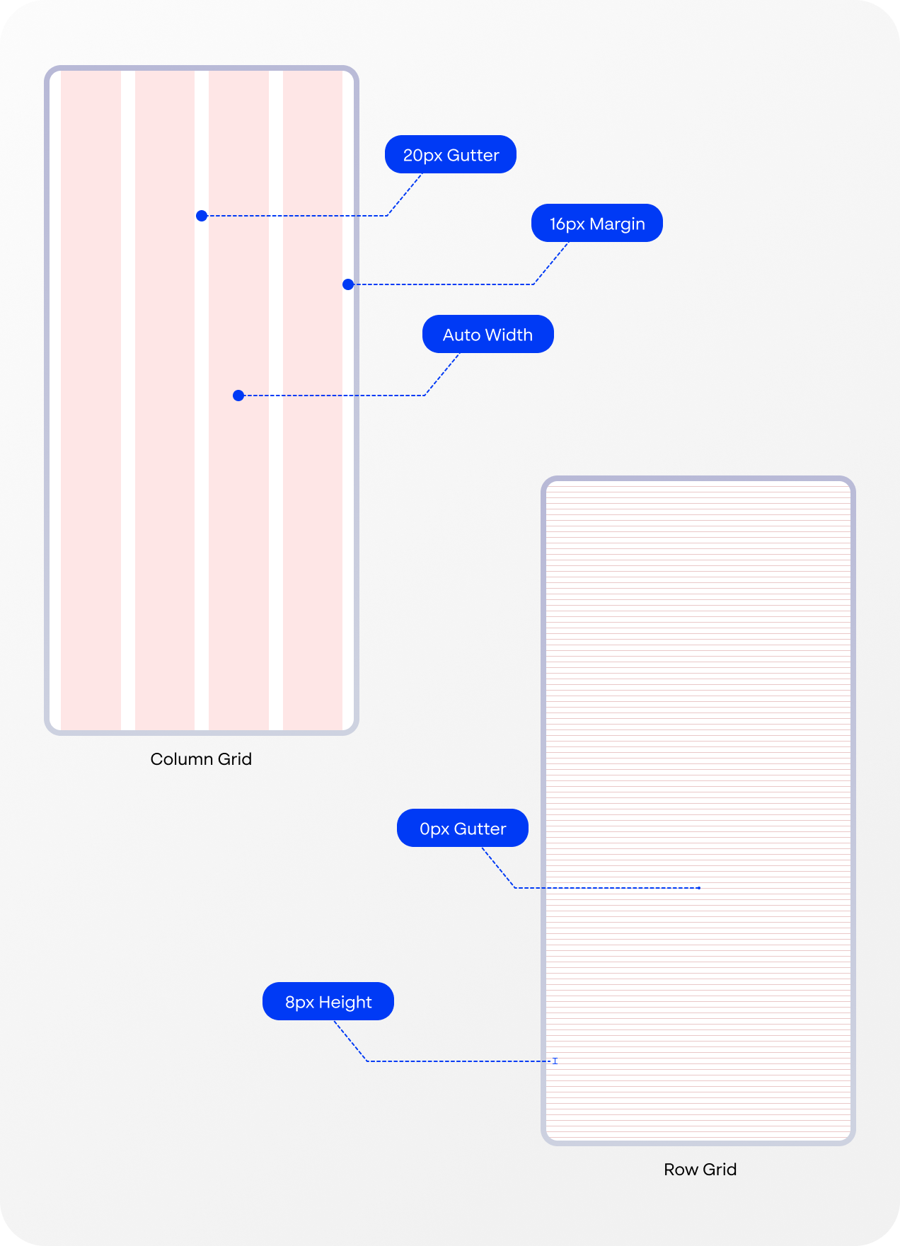
Grids
A 4-column layout is utilized to create a structured and adaptable design framework. The grid incorporates 8px-high rows, enabling precise alignment and a balanced visual rhythm across all interfaces.
Wireframes
The mid-fidelity wireframes bridge the gap between conceptual ideas and visual design. These wireframes serve as a foundation for testing and refining user experiences before moving to high-fidelity designs.
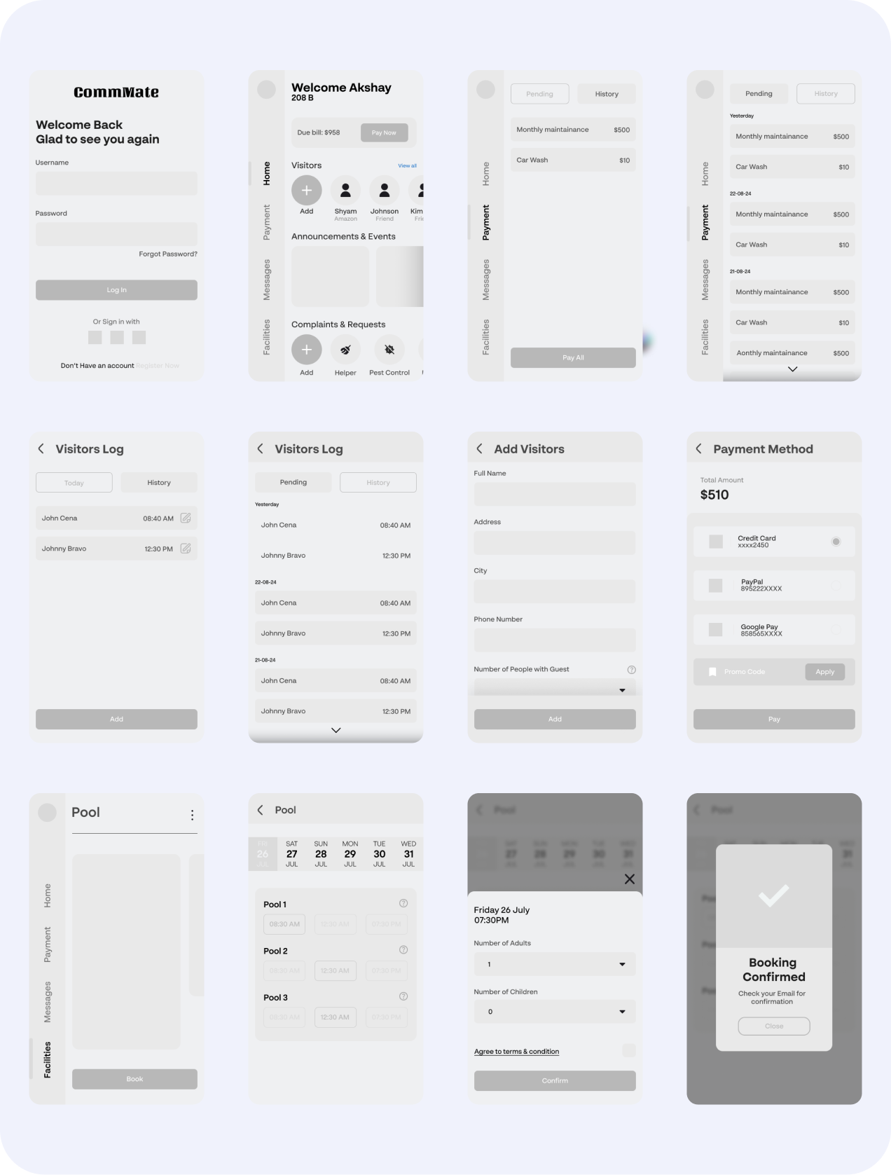
Hi-fi screens version 1
Feedback:
1. Unconventional position of navigation leads to inconvenience & unnecessary learning curve for users
2. Tabs do not look like buttons, which will lead to confusion among users
3. The payments page is loaded with info. which might be overwhelming for users
4. Should incorporate more icons in the design
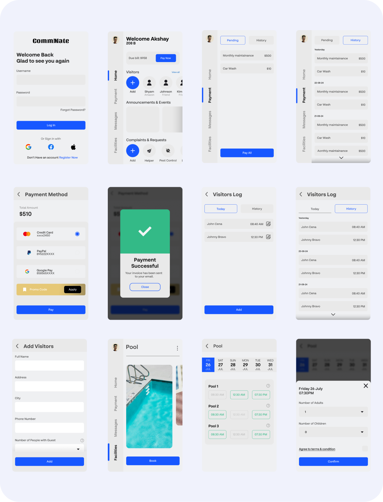
Hi-fi screens final version
Final screens after all the iterations