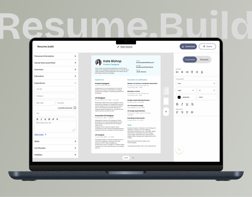
Resume builder
This UI/UX concept project focuses on designing a modern, user-friendly resume builder platform. The goal was to streamline the resume creation process through intuitive navigation, clean layouts, and interactive components. Key features include customizable templates, section-based editing, real-time preview, and AI-assisted content suggestions—ensuring users can create professional resumes efficiently and confidently.
Landing page
This landing page for the resume builder platform is designed to engage users by addressing their need for an accessible, user-friendly tool to create professional resumes. The page highlights the problem it solves: enabling individuals without design expertise to effortlessly craft standout resumes.
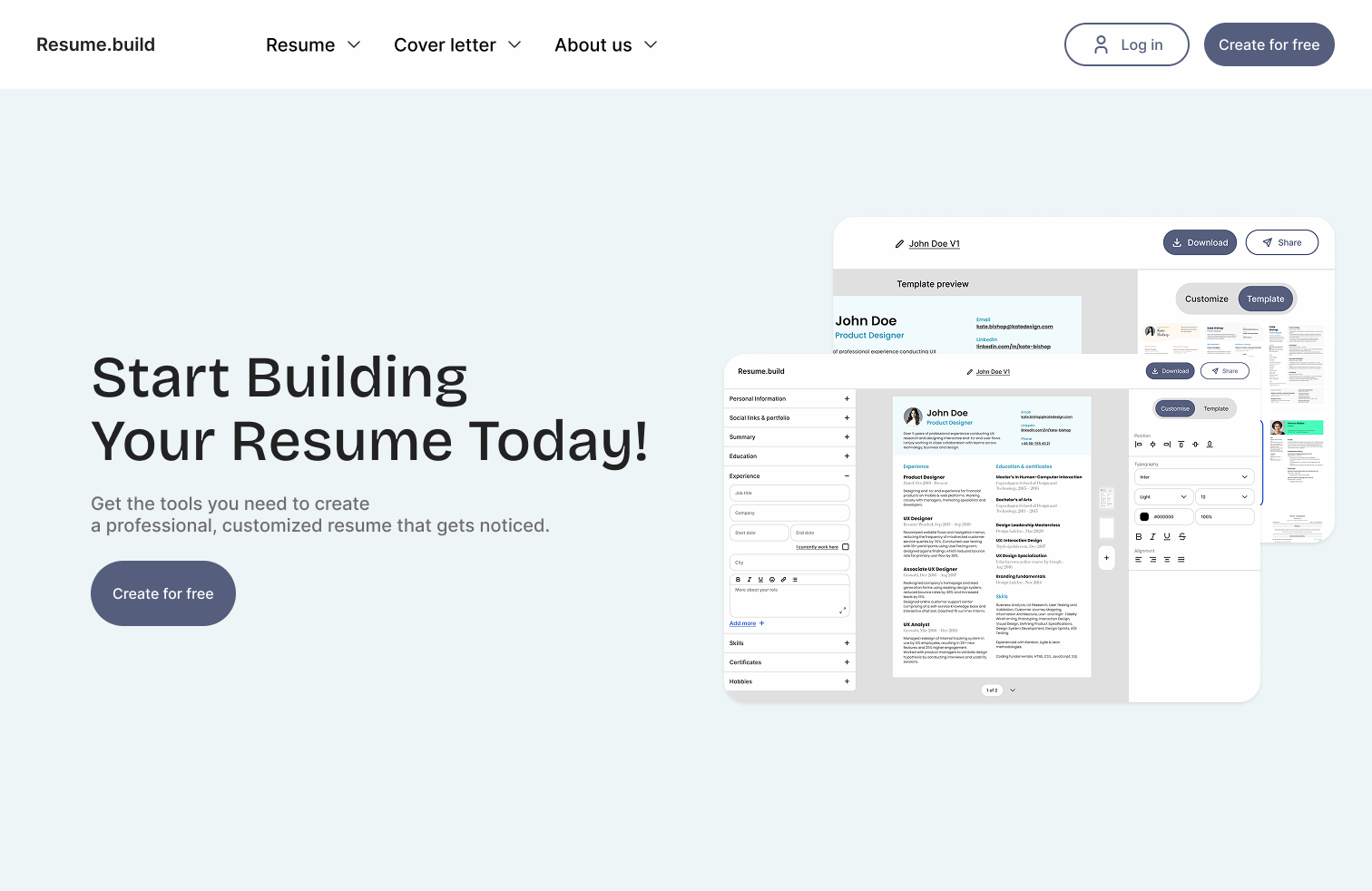
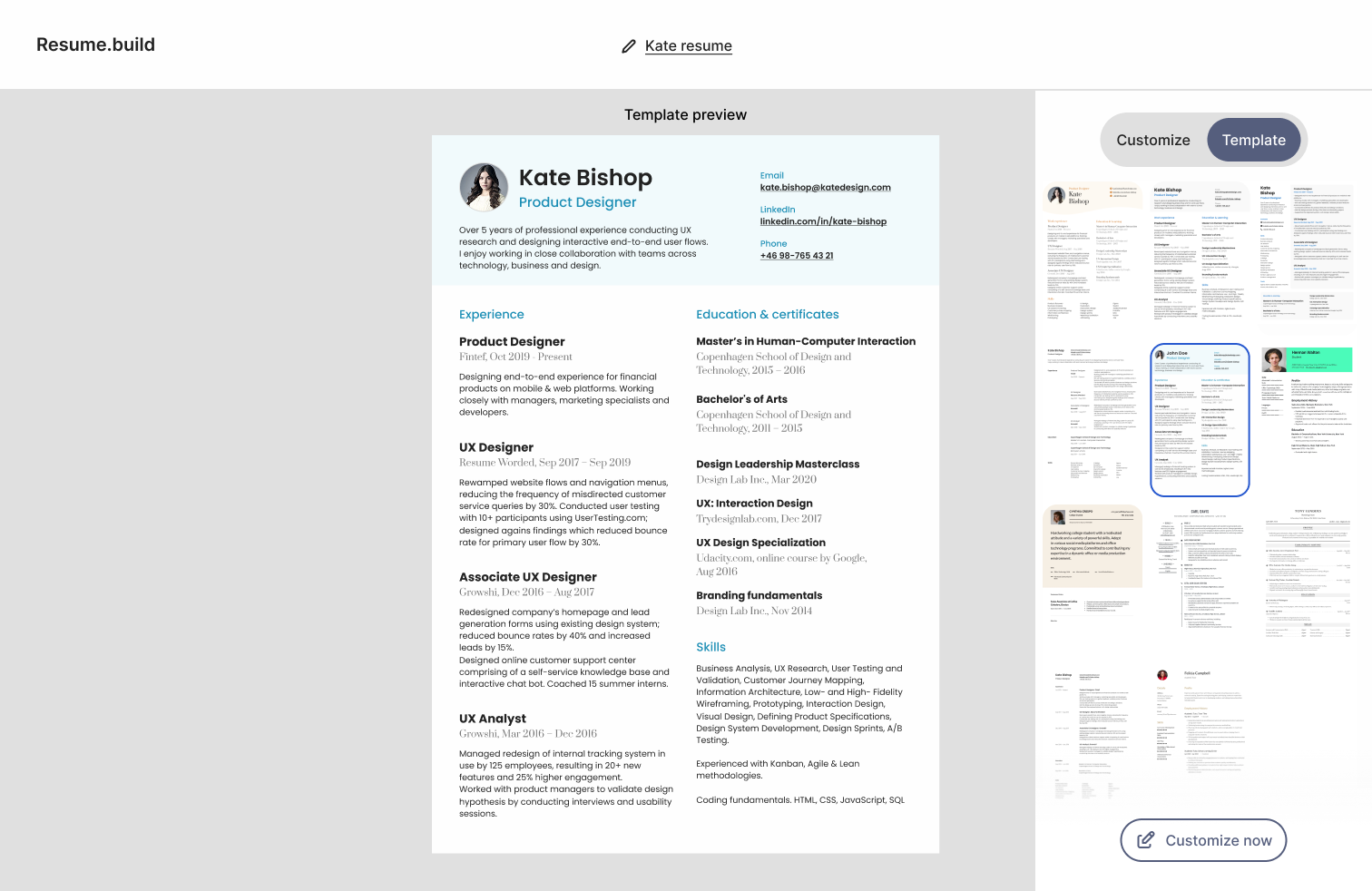
Select the template that you like & start customising.
Two-Panel Layout:
-Left Panel: Shows a detailed live preview of the selected template to give users clarity on how their resume looks.
-Right Panel: Contains template options in a grid, allowing users to quickly compare designs and switch.
Template Interaction:
-Selected template is highlighted with a bold border for easy identification.
-"Customize now" button reinforces the action step clearly.
Header and Controls:
-Clear download and share options in the top-right corner for easy access.
-Title “Template preview” ensures users understand the context.
Visual Clarity:
-White background and soft colors keep the focus on the content.
-Well-structured typography with bold headings, colored section titles, and readable fonts.
User Guidance:
-The interface flows from selecting a template to customization, guiding users logically step-by-step.
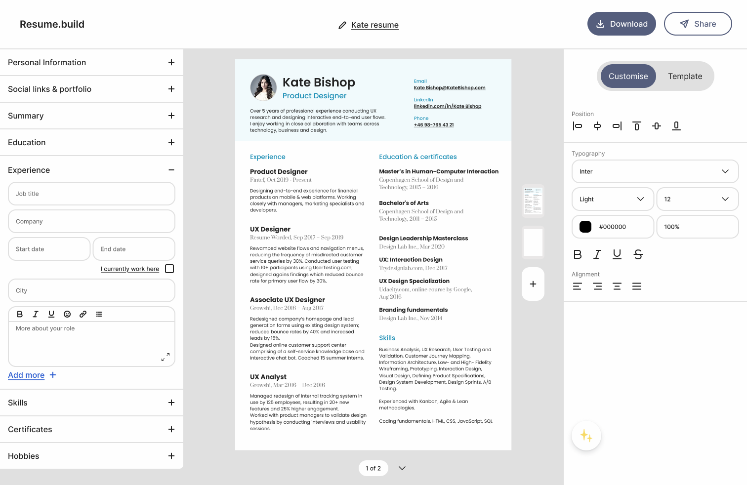
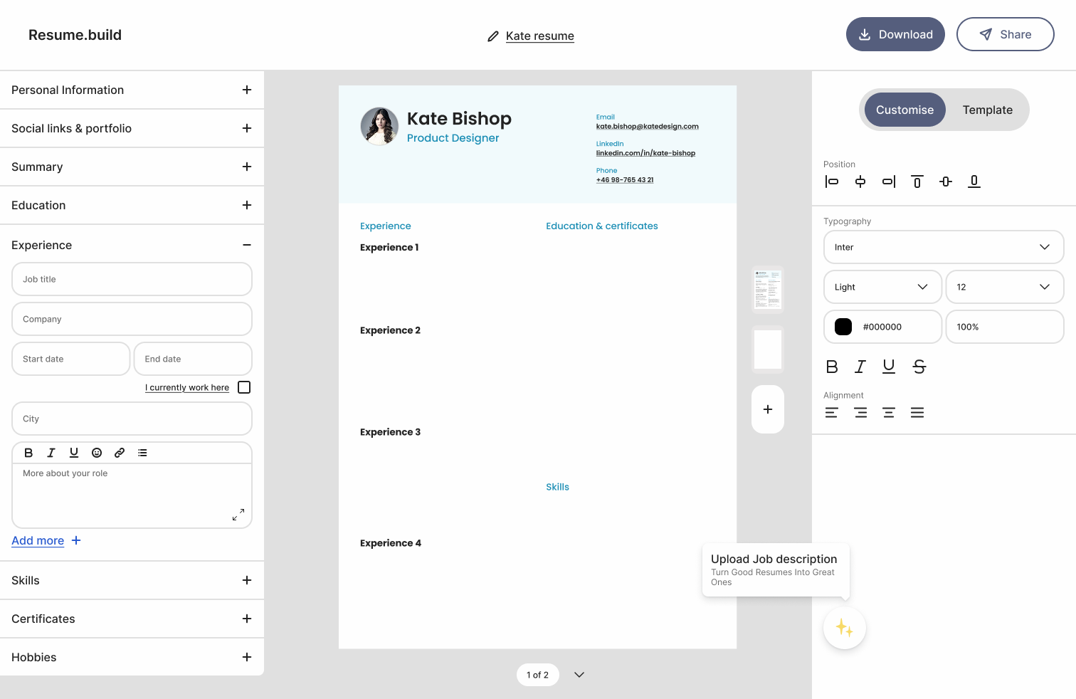
Customise screen has fixed heading, expanding them will allow you to add your data.
Template Interaction:
-The resume preview visually reflects style updates, ensuring users can instantly assess changes.
-A “Customize / Template” toggle allows users to switch between style editing and template selection seamlessly.
Header and Controls:
-Download and Share buttons are prominently placed in the top-right corner for quick access, encouraging users to save or distribute their resume.
-Resume title ("Kate resume") is editable, offering clear labeling of the current file.
Visual Clarity:
-Clean layout with plenty of white space enhances focus and readability.
-Typography options allow control over font style, weight, size, and color, supporting accessibility and personal branding.
-Icons for formatting (bold, underline, bullet list, etc.) are intuitive and standard, reducing the learning curve.
User Guidance:
-Logical flow: The interface guides users from entering personal info to experience, education, skills, and finally styling.
-Helpful hints (e.g., “Upload Job description – Turn Good Resumes Into Great Ones”) suggest enhancements without being intrusive.
-Real-time preview ensures that even non-designers can confidently build a polished resume.
You can expand the description field for better view & upload job description there too
Content Editing Interface:
-Centered Modal Layout: Focuses user attention on one task — writing or refining job descriptions — without distractions from the rest of the interface.
-Expanded Text Field: Allows more room for users to write detailed, structured descriptions, improving usability for longer entries.
-WYSIWYG Editor Toolbar: Positioned at the top with clear formatting tools (bold, italic, underline, bullet list, etc.), enabling quick text styling with minimal effort or learning curve.
AI & Guidance Features:
-Job Description Upload: "Upload job description" button encourages users to provide contextual data, enabling personalized AI suggestions.
-AI Prompt Banner: Subtle yet helpful tip (“✨ Use our AI model to tailor your description”) reinforces intelligent assistance without being intrusive.
Two Clear Call-to-Actions:
-Upload job description: Guides users toward enhanced AI use.
-Done: Easily allows users to exit and save changes.
Visual and Functional Clarity:
-Soft Shadow and Rounded Corners: Helps the modal stand out from the background without being too sharp or jarring.
-Consistent Button Styling: Matches the look and feel of the main UI (rounded, dark blue buttons), maintaining design cohesion.
User Experience Focus:
-Large Modal Size: Provides a better typing and reading experience.
-Escape & Close Options: Users can easily close the modal with the “X” or complete their task with “Done”, catering to different navigation preferences.
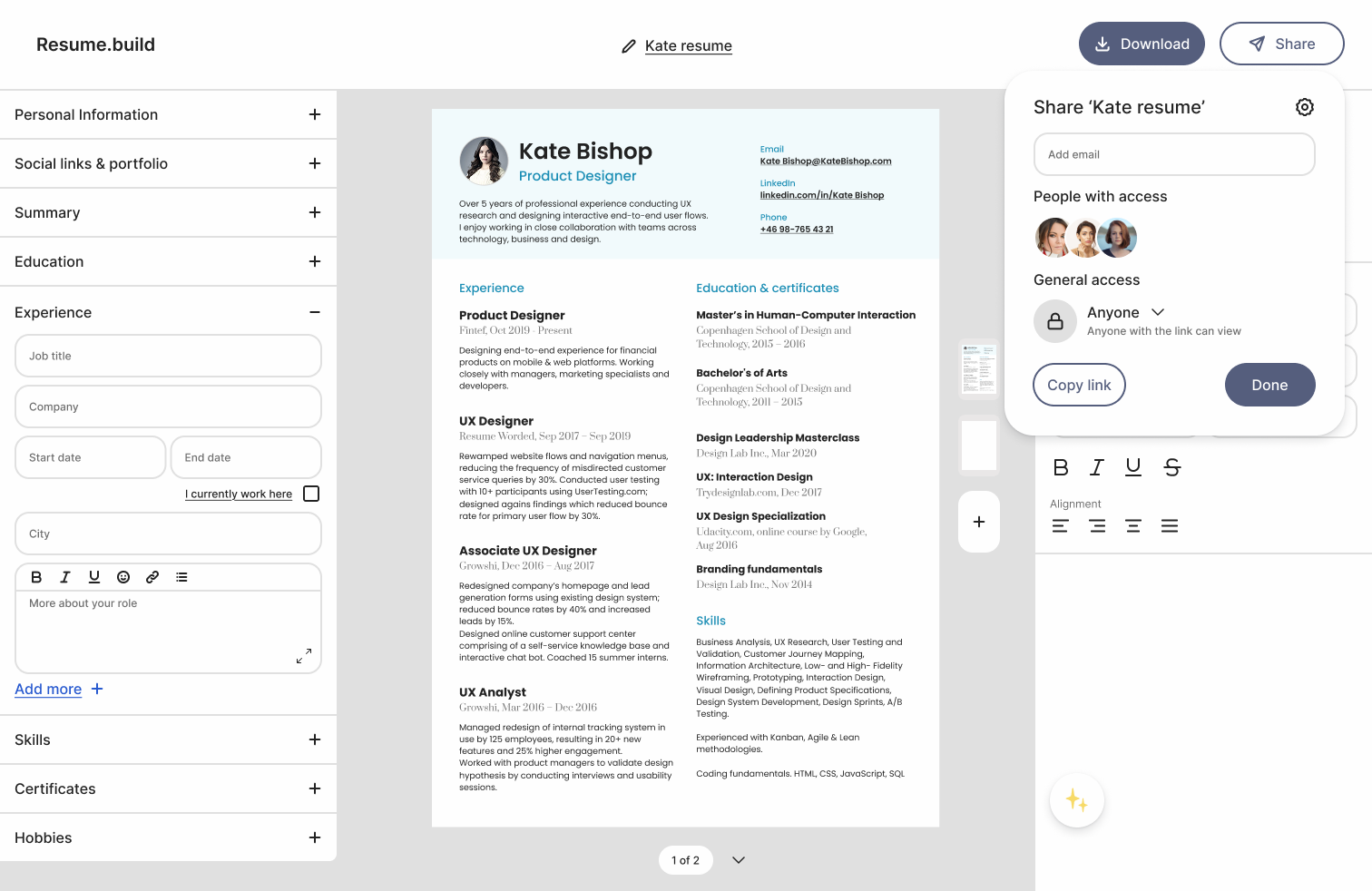
download & share it with recruiters
Sharing Modal Design:
-Clean, minimalist modal overlay that doesn't obstruct the main resume content.
-Uses common collaboration UX patterns (like Google Docs), making it instantly familiar to users.
User Roles & Access:
-Add Email Field: Direct email invites foster team collaboration or peer review without needing to leave the platform.
-People with Access Avatars: Visual confirmation of who already has access provides transparency and control.
Access Control:
-General Access Dropdown: Gives users clear control over privacy — “Anyone with the link can view” is clearly labeled and adjustable.
-Copy Link CTA: Highly visible and actionable. The “Copy link” button encourages instant sharing without confusion.
Consistency:
-Unified Style: Rounded buttons, typography, and spacing match the overall UI theme, contributing to a cohesive experience.
-Placement: The share button is logically located near the download button, aligning with user expectations for export/sharing actions.